
Today I tested ChatGPT Image 2.0 with a few different visual directions. My overall impression is simple:
It is clearly better at understanding intent than many previous general-purpose image models, especially when the task is a web illustration, a concept image, or a visual draft.
But it is still not something I would trust blindly. It is good at producing a strong first version, not at replacing human judgment.
Step 1: how the prompt was written
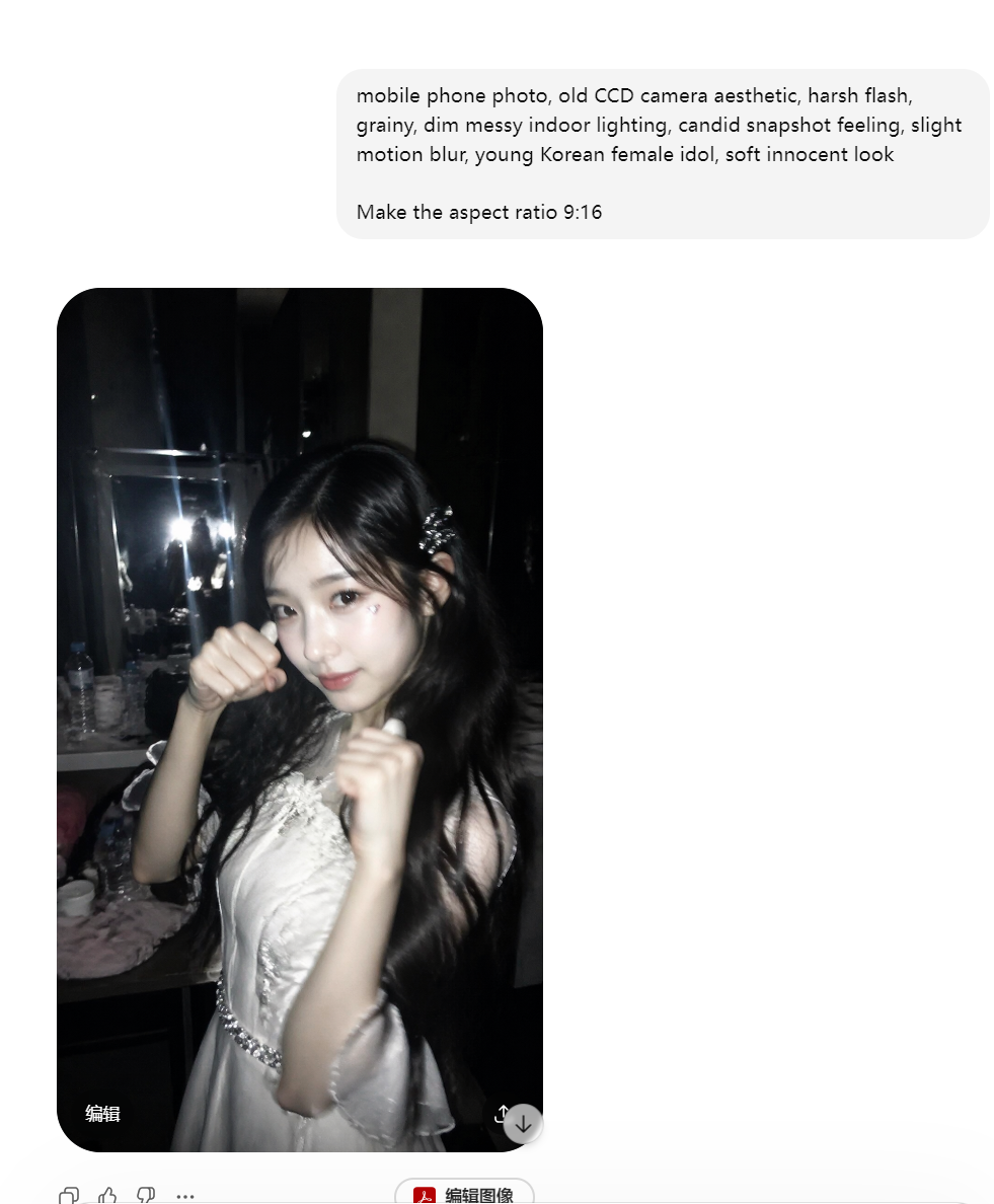
The prompt for step1 was inspired by a case from EvoLinkAI’s prompt collection: Case 12: CCD Camera Flash Korean Idol (by @BubbleBrain).
The useful part is not that you should copy the prompt directly. It is useful because it shows how a strong image prompt is usually structured: subject, camera feel, material, lighting, atmosphere, and concrete visual anchors.
If you do not know how to write a prompt yourself, the easiest workflow is to describe your need in plain language first, ask AI to draft an English prompt, and then review it yourself. Remove unnecessary details, check whether the style is drifting, and make sure the prompt does not over-constrain the image.
Web-style illustration
I have been working on a project recently, and the landing page needs a few illustrations that fit the overall visual style. The prompt below came from describing the content requirement first, deciding the style direction, asking ChatGPT to draft a prompt for me, reviewing it briefly, and then generating the final result.
If you just want a style-consistent illustration for a blog post, introduction page, or product page, this is already quite useful.
The prompt was:
Create a clean, minimal commercial-style illustration for "Cultural Tourism Data Mining". The style should be simple and modern, with ample white space and a clear spatial hierarchy. Use isometric perspective with abstract, simplified elements representing big data analysis: charts, graphs, dashboards, icons, and simplified human figures interacting with data. Include subtle scenic references (mountains, water, cultural landmarks) in the background. Keep color palette minimal with 1-2 main colors and soft accents. Focus on conveying the concept of data-driven cultural tourism analysis, including data cleaning, topic extraction, and trend summarization, suitable for business presentations or web pages. Emphasize conceptual clarity and readability rather than full data display.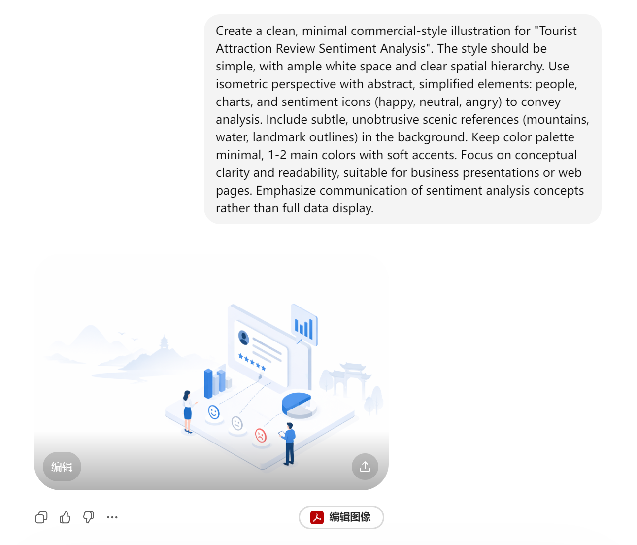

This type of image has two obvious advantages:
- The composition is more stable and does not fall apart at first glance.
- The style follows the intended direction more naturally.
For blog covers, web illustrations, and product concept images, I think it is already good enough to enter the workflow.
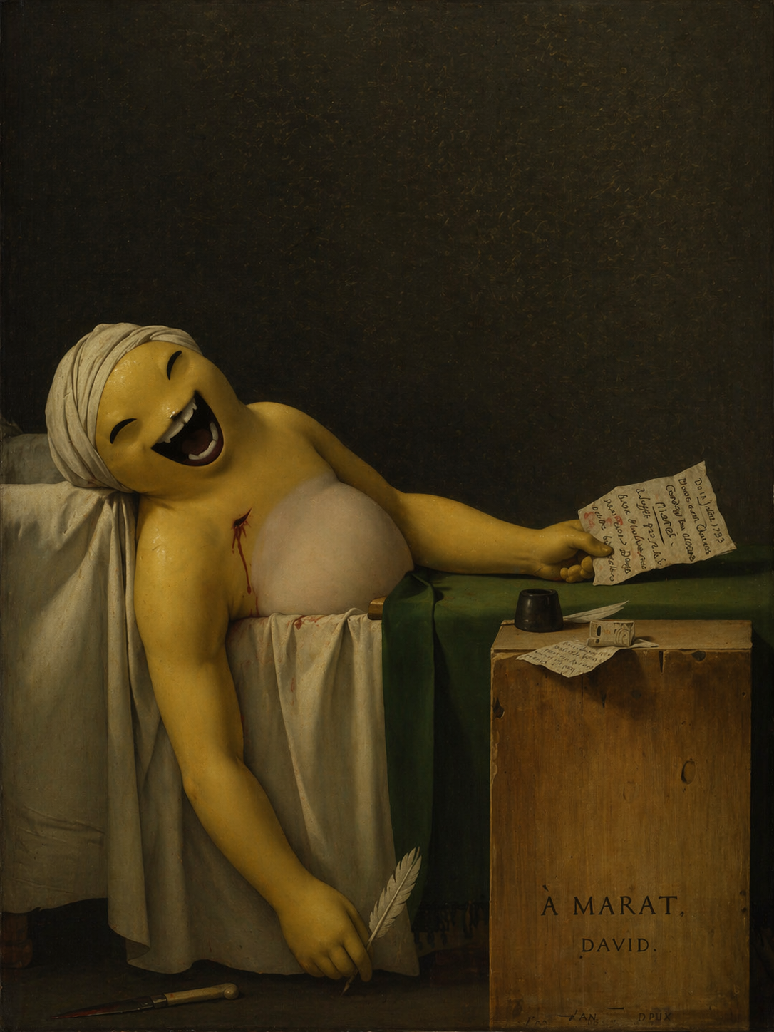
Abstract and style tests
warning
The following images are closer to style tests, abstract visual experiments, and mood-driven image generation. They should not be used as references for factual accuracy, functional design, or production-ready visual communication. They only show how the model handles atmosphere, texture, and visual impact.
This section is included only for fun. The source images were collected from the internet. I respect and appreciate the original artists. If this part feels inappropriate to you, just skip it.
note
Death of Naiwa
note
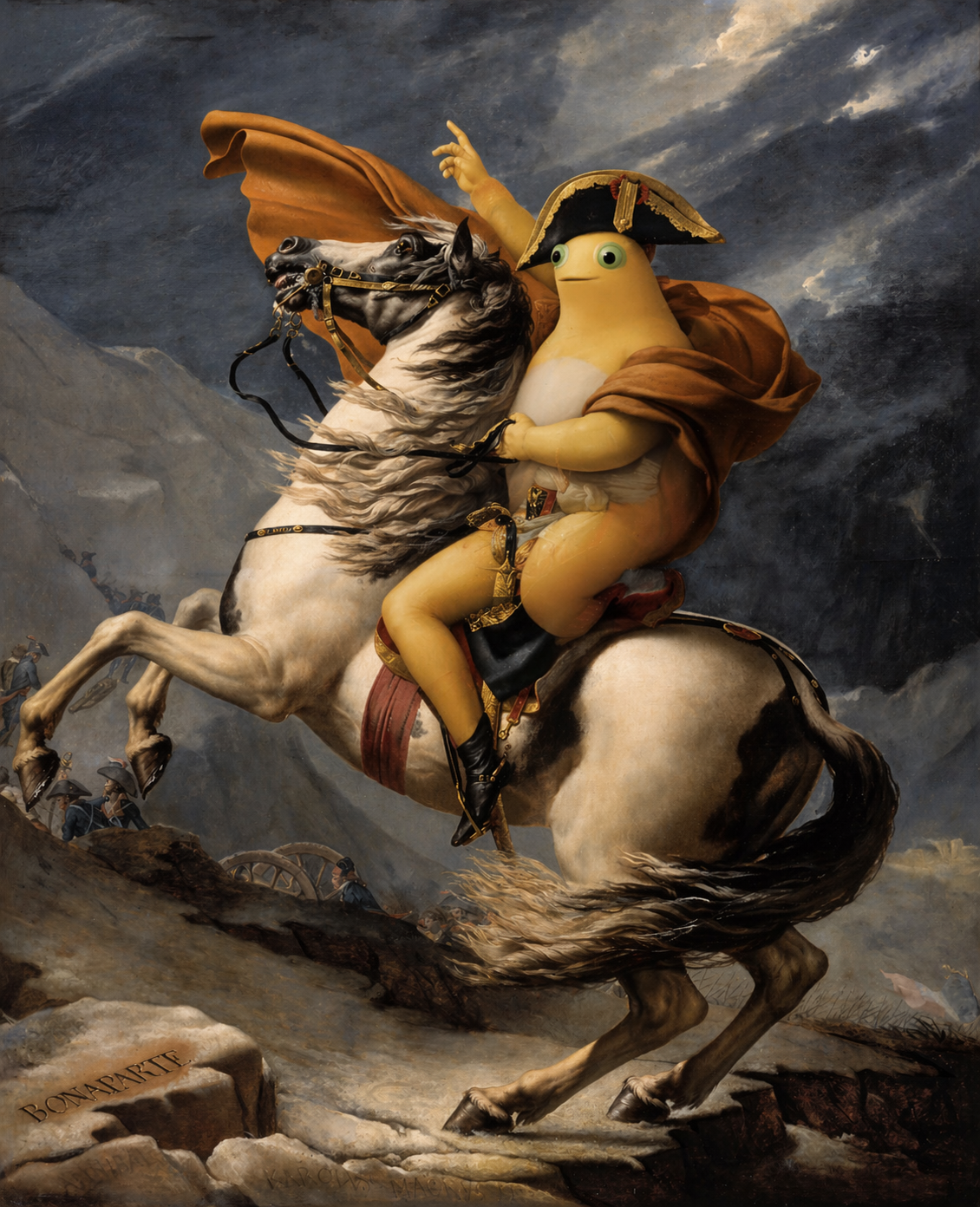
Naipo Wheel Crossing the Alps
note
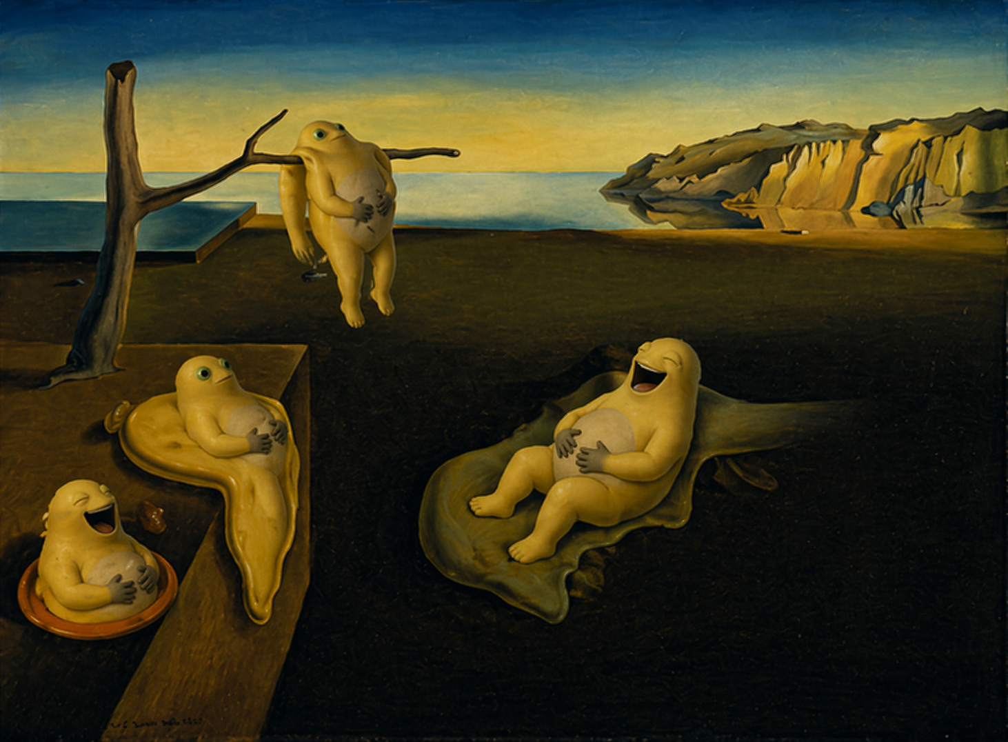
The Eternity of Naiwa
note
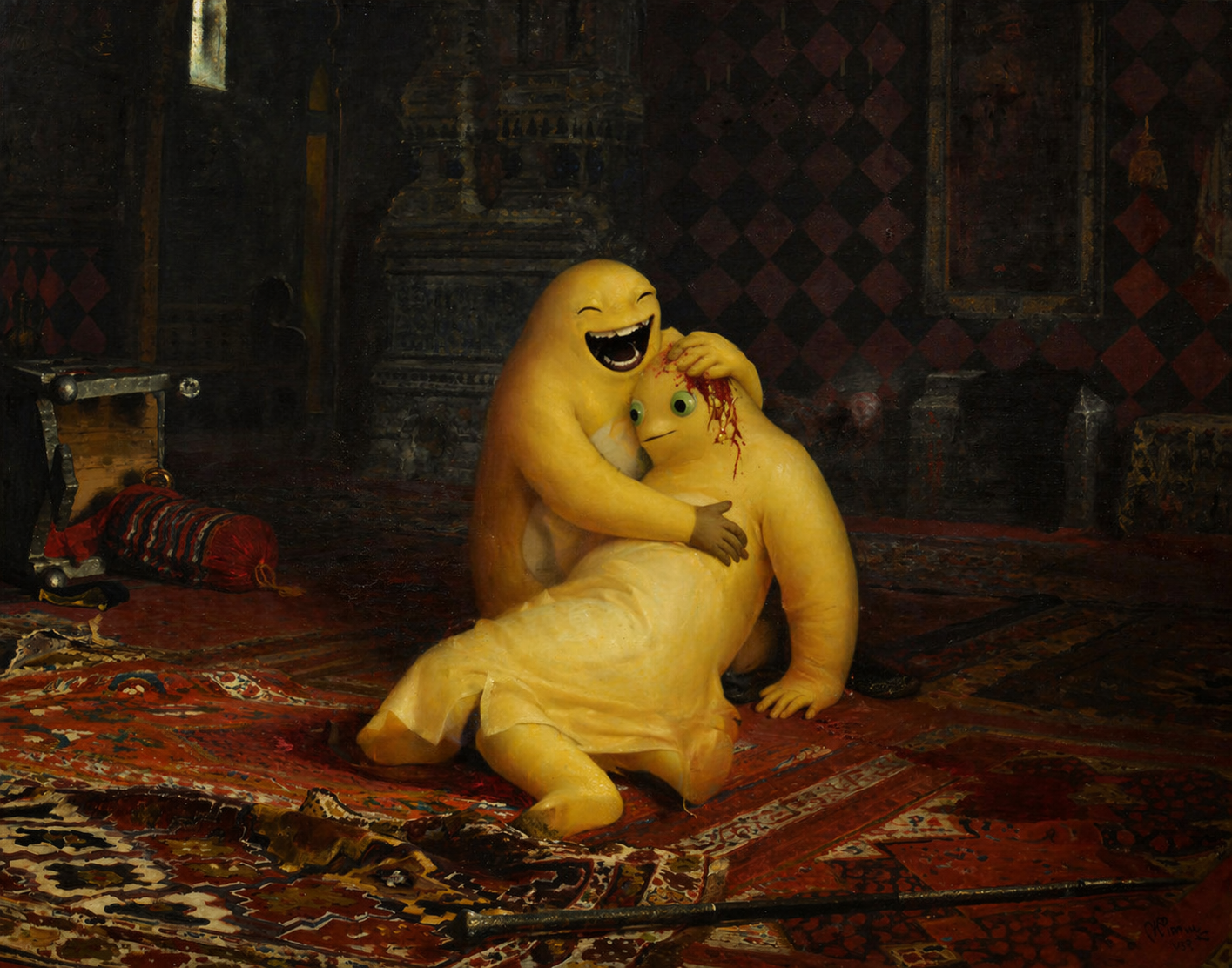
Emperor Naiwa Kills His Son
Final thoughts
If you need web illustrations, cover images, or concept visuals, ChatGPT Image 2.0 is already worth using.
If you need absolute control, factual accuracy, or a final production asset, it is still not enough by itself.
I also found its anime-related output only average in this round of testing. It is not unusable, but it still feels far from being truly stable at understanding anime style, character language, and the small visual cues that make this kind of image convincing.
Comments
Join the conversation — sign in to leave a comment.
Login with GitHub